
A Flashback to Sundance Film Festival 2018: Our Top 5 Movie Posters
The Sundance Film Festival is coming up in January 2019, and we thought we’d take the time to look back at some of our favorite movie poster designs. We chose some of our favorite designs, regardless of the movie’s reviews (but you can let us know what you thought about each film)!
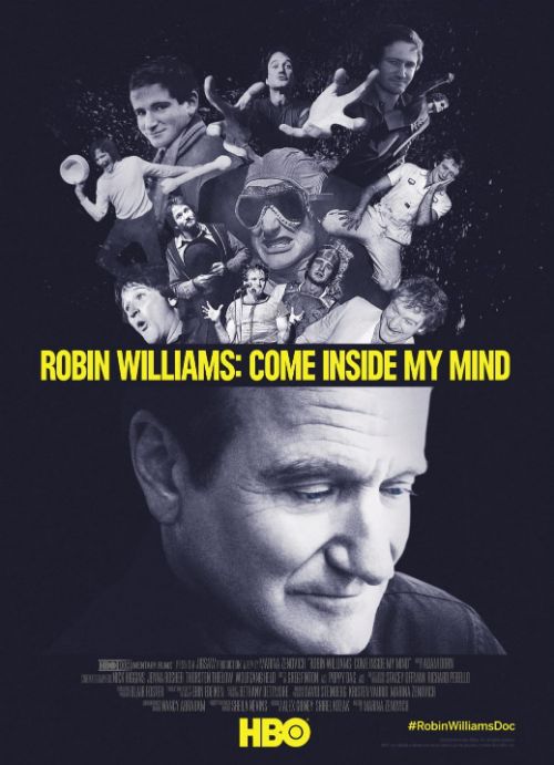
1. Robin Williams: Come Inside My Mind
This is our favorite poster from Sundance 2018! Some important design elements in this poster are the colors, the text, and the imagery. Most of this poster is black and white, which contrasts quite well with the bold yellow. Where the text is placed makes it easier to envision that all of the images above are actually pouring out of his head, which is a great visual representation of what the movie is about. The images themselves are spliced together in a way that while isn’t natural, doesn’t look out of place.
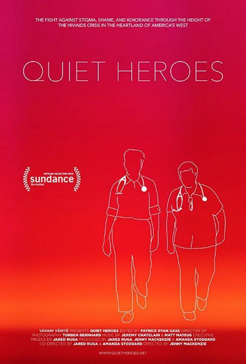
2. Quiet Heroes
A more simple design, the poster for Quiet Heroes stands out with its subtle use of gradient color that almost gives the appearance of a sunset. The lineart is simple, but distinguishable about what the image is supposed to be, with thicker lines on the stethoscopes to draw attention to the fact that the film is about doctors.
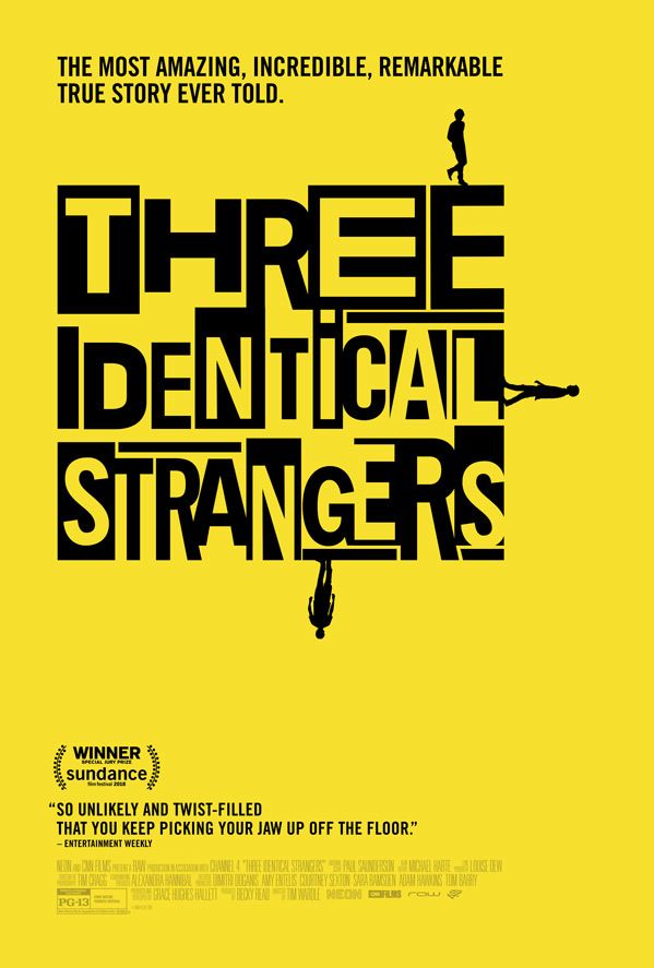
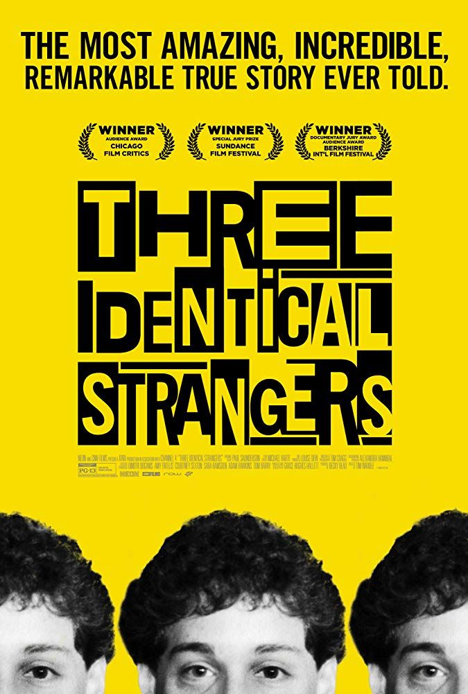
3. Three Identical Strangers
If you’re looking for unique typography, the movie poster for Three Identical Strangers is a great example! A good reason this poster is so effective is because it is still easy to read, even with the contrasting black and yellow letters. The bright yellow definitely stands out, but keeps it simple. There’s another version of the poster with black and white images of the three stars, which introduces a sense of symmetry, as everything is centered, drawing your eyes straight down the middle across the whole poster.
The bright yellow definitely stands out, but keeps it simple. There’s another version of the poster with black and white images of the three stars, which introduces a sense of symmetry, as everything is centered, drawing your eyes straight down the middle across the whole poster.
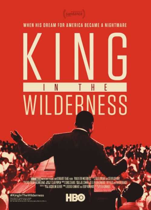
4. King in the Wilderness
We love the more subtle details of this poster. The main part of the poster is taken up by an image of the portrayal of Martin Luther King Jr. To make him stand out even more, the text of the movie is technically placed behind the image, as evidenced by the overlap. The text and lighting is used with a cream, not pure white, adding to the retro vibe of the color scheme.
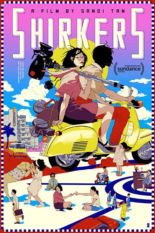
5. Shirkers
Definitely one of the more wild designs on our list, Shirkers stands out because it’s all graphic artwork, not photography. Unlike the rest of the movie poster designs on our list, this one doesn’t have a color scheme. In fact, the wide usage of color makes it pop, but it’s still important to note that the title of the film is easy to read, and it’s easy to see what’s going on in the poster.
Planning on Going to Sundance This Year?
At Presto Print, we’re passionate about printing, which is why we love to see all the amazing designs and prints that are used during the festival. If you’re planning on going this year, don’t forget to look at the posters! What kind of posters make you want to see its movie? Let us know on Facebook!
Need Posters for Sundance?
Are you prepping for Sundance? If you want bigger posters, banners, or advertisements for your film, we’ve recently added a new printer to our arsenal of equipment. It can do any wide format printing, so if you need something big and bold for the festival, we can help! Our machine can print:
- Banner stands
- Step and repeat backdrops
- Vinyl banners (outdoor and indoor)
- Adhesive vinyl including lettering
- Life-sized wall decals
- WIndow clings
- Canvas
- And more
If you need movie posters, we can do that too! Contact us today for a free quote.